Practice to color shades and shadows of hairs and lights of a character
This is the note for my practice to an illustration as a beginner.
Today's illustration
The next left illustration is the one before I practiced and right onw is after I did.
| Before | After |
|---|---|
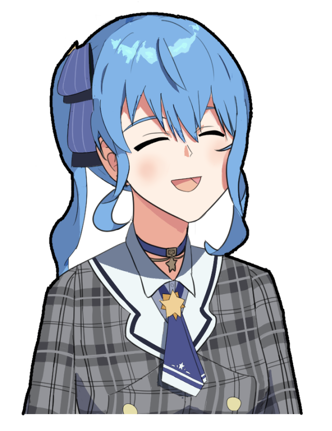 | 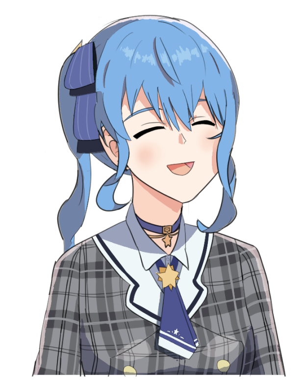 |
In this time, I practiced and learned these things
- Colors for shades and shadows of hairs
- Even if the color of shade and shadow is different from the basic hair color, it doesn't screw up the illustration. The different color gives a different impression as well as another information of a character.
- Colors depend on each character, and it's OK to use the different color for shade and shadows even though different characters have the identical hair color.
- Colors for lights
- This also affects how you wanna show your illustration, especially what the surrounding area of the character is.
Besides the above points, I modified a little bit about shade and shadow colors to make them weaker. To practice, I tried these steps to improve this original illustration:
- Reviewed my illustration by myself
- Picked up a few things for improvements
- Practiced and figured out a few things I though I can improve
- Redrew my illustration and checked what was improved
Before coloring shades and shadows
The illustration I practiced today is the one I drew on this article. And before drawing shades and shadows, I modified several things to improve it:
| Original | Modified |
|---|---|
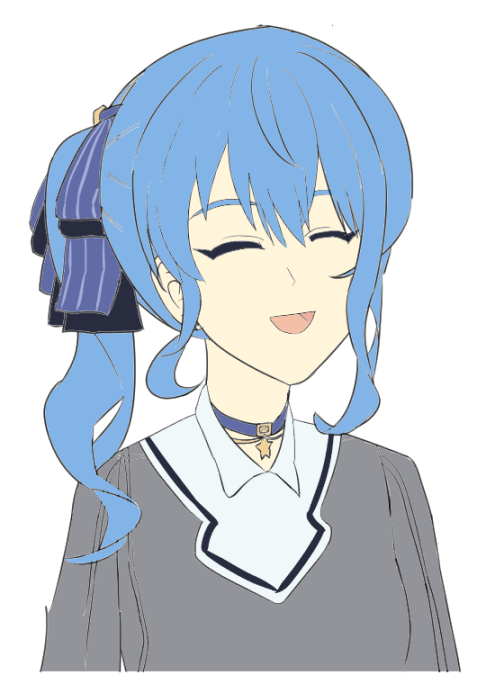 | 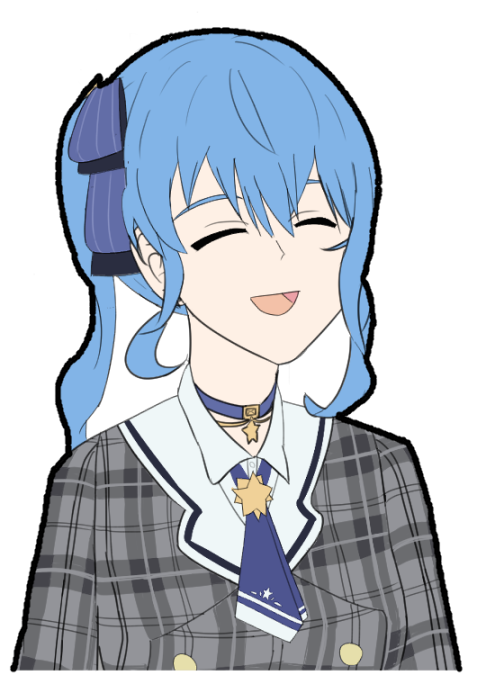 |
What I modified was
- Changed color layer below to line layer, which I learned on this article.
- Edited the eyes' positions lower, and also changed their angles little bit
- Edited the head smaller
- Edited the sidetail hair and hair ribbon closer to the ear
- Added details on the cloth
- Added a frame line
- Changed a skin color from too yello to red-ish
After these changes, I added shades, shadows, and high lights on the illustration.
| Before coloring details | After coloring details |
|---|---|
 |  |
Review my illustration
I reviewed my illustration after I painted shades and shadows.
What can be better
- Face can still be more natural, further
- Lights can be more emphasized using highlights on many places other than hairs.
- The star on her tie can look less flat
- Cheek can be drawn more natural
- Hair can be made less flat, especially the front part of her hair
- Her plaid jacket can look less flat, probably because no shade nor shadow
- Her hair ribbon can look more solid, especially lower part of ribbons should look the far side more than the above one
- It's not weird, but it might be more modern that the color of shadows are closer to the original skin?
What was drawn well
- Overall colors of shadows and how they looked. I intentionally chose strong colors for shadows
- Hair highlights. This was one of the most difficult thing for me to draw well on this illustration
- Where I should add shadows
Practice and lessons
At first, I watched a few videos for shades, shadows, and lights. I had checked some of them, but revisited again in order to get ideas better and refreshed my memory. Unfortunatelly, all fo them is Japanese audio.
- YouTube: Naoki Saito illust Channel - How to draw attractive hairs of characters for digital illustrations (Japanese)
- YouTube: Deep Blizzard's Art School - How not to fail choosing skin colors of characters for digital illustrations (Japanese)
- YouTube: Deep Blizzard's Art School - How to Shade Hair [Super Introductory Course #40] Deep Blizzard (Japanese)
After watching these videos, next things are especially something I remembered well:
- The shade and shadow colors of hairs can change impressions of characters. In other words, we do not have to stick with which color is right or not. It's one way to change impressions of a character.
- More details of shades, shadows or lights are added, more relistic an illustration is.
- But anime character illustration is a way to deform a person, so sometimes, more realistic doesn't always mean it's good.
- If the highlight of hairs is jagged, then it shows the pieces of hairs are lighten up
- But I feel if we try to draw jagged too much, it's gonna be more realistic drawing rather than deformed one.
So, from these learnings, I felt next things are important and decided to try practicing these things mainly for this illustration:
- Hair's shadow colors
- How to draw lights
Hair's shade and shadow colors
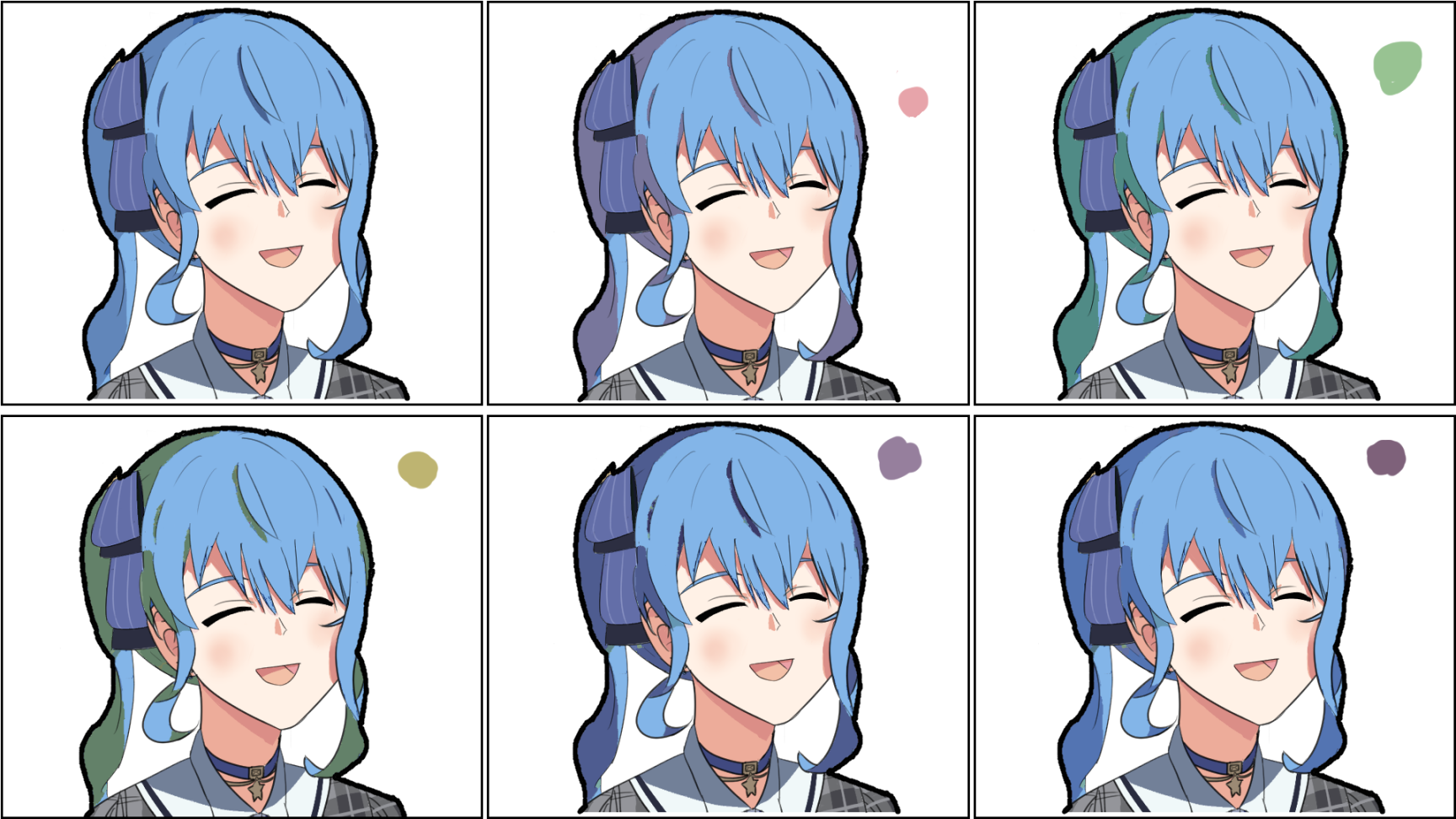
Following what Naoki said on this video, I did the same things to change multiple colors for how different color of shades and shadows changes impressions, and decide which one looks the best. But when I tried doing it, I noticed I cannot color to what I wanted, because I usually use a "multiply" layer for shade and shadow, and it is affected by the color of its base color layer.
So, I tried a multiply layer to add a few colors which I wanna show, and also use a normal layer to color the shade and shadow for what I wanted to try. These are the things I tried.
Using a multiply layer. I wanted to color shade and shadows to red and yellow in a few of them, but it shows purples and green, respectively.
Using a normal layer.
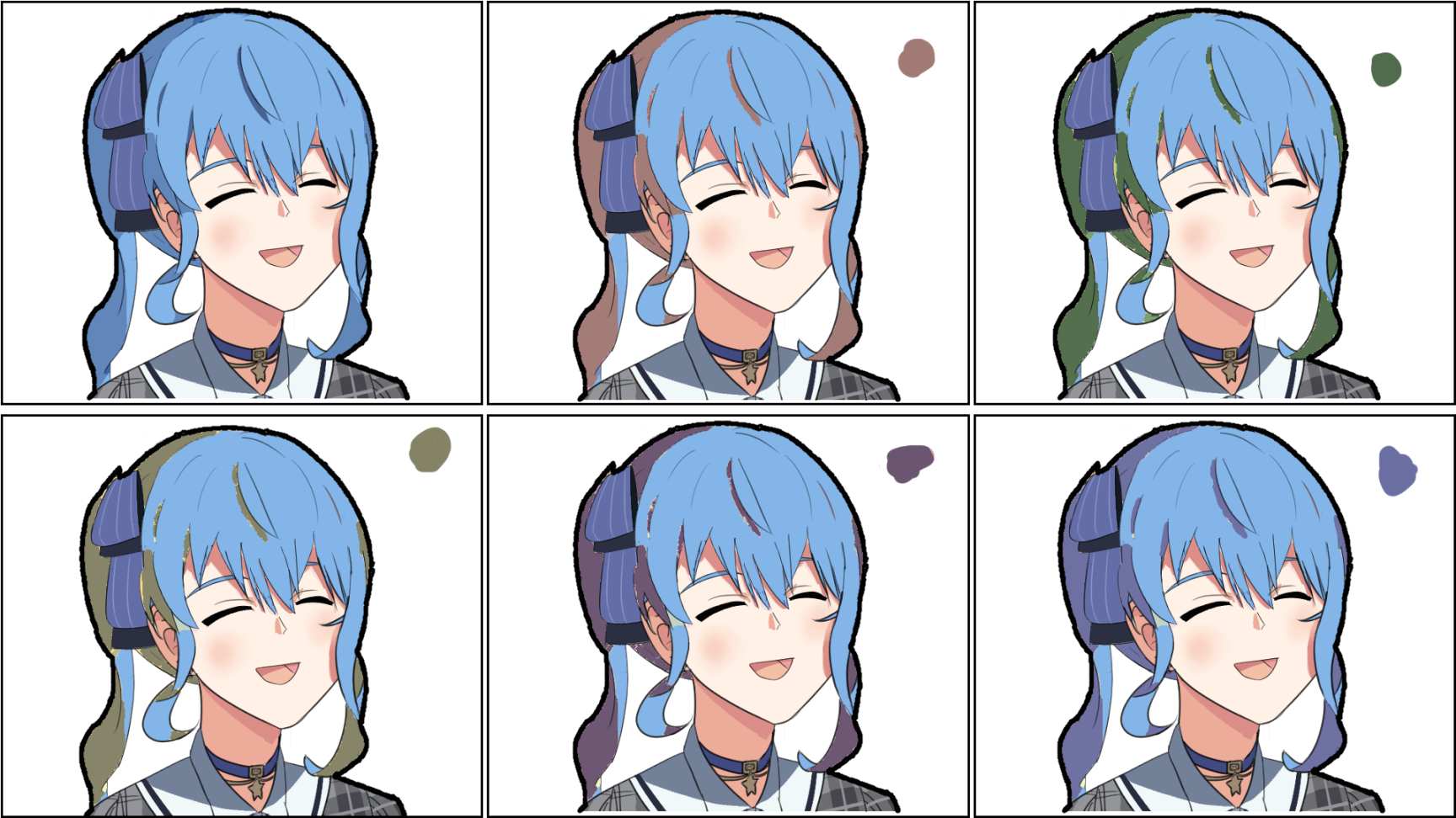
From these practices, what I felt was
When shade and shadow is colored by different colors like red, yellow, or green, it adds new information or impression the character.
- On the other hand, because the base hair color is blue, when shade and shadows are colored by one close to the base color, it doesn't change any impression.
Using multiply layers can add shade and shadow with different colors, but sometimes it leads to unexpected colors. It looks more natural and fits to an illustration easily, but it might not be something you wanted.
Using normal layers with different colors, it can add different colors easily, but it's challenging to use completely different colors. It might be good in a few cases, like characters in a fantasy story, but may not be good in some cases.
I actually like to add red shades on the above practice, because I felt it added an impression for passionate and warmth, so I decided to use it, though her character color is blue.
Attempts to learn how to draw lights
I couldn't find very good videos or articles to talk about where we should put lights on faces or clothese concretely, so I tried a few ways to add lights and see what and how it changes.
Practice:
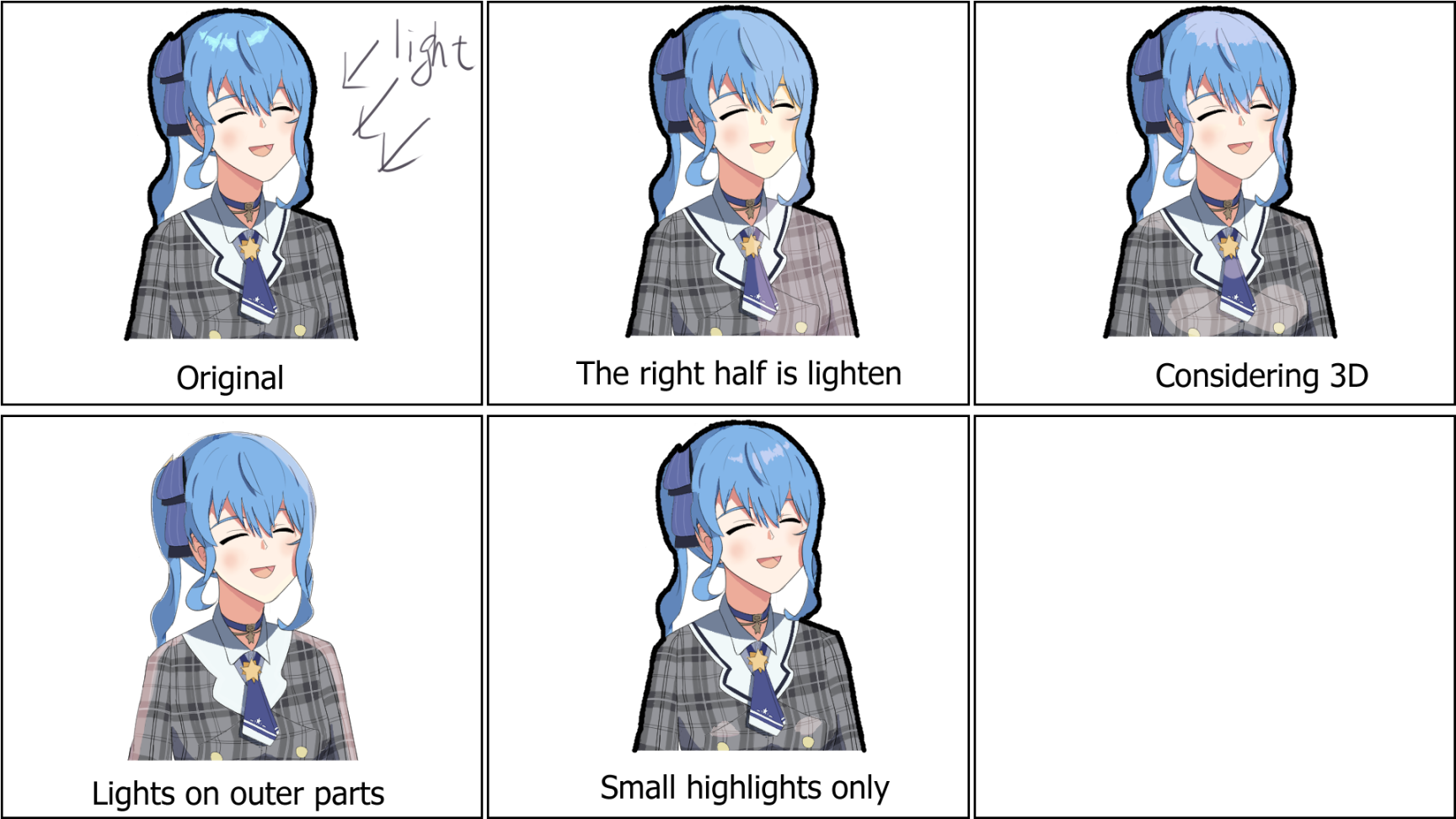
I only tried 5 patterns where I should put lights. I couldn't come up with other ways to drastically change the lights except changing light colors. But I guess changing light colors is almost similar effect which I learned from shades and shadows, so I skipped it. Also, as you can see, I removed a black outer line from "Lights on outer parts" illustration because it reduced effects of lights.
From this practice, things I thought:
- Adding lights can be used to get paid attentions to the places where are lighten part
- Because it is strongly get paid attentions, if lights are not important, it's better to draw them only a small amount
- When lights are drawn on a specific side, it strongly emphasizes the existence of lights and i felt the light in such an illustration is very important factor.
- The lights on the border of a character are a little bit different impressions from other lights. I can be wrong but it's more like emphasizing a character her/himself, like a character is lively.
- Though I also felt it implies the environment or situation is filled with a full of lights
What I redrew and what was improved
So from these learnings, I redrew my original illustration, as I showed it on the beginning of this page.

Besides changing the color of shade and shadow of hair and highlights, I edited the color for other shades and shadows too, in order to make them weaker. It might not be necessary, but I felt it implied how dark her surrounding environment was.
From what I learned, I think it changed my illustration well. These things completely depend on how I wanted to show on the illustration, and not something like there is a correct answer, but it makes the illustration be what I wanted to imagine a little bit, to show that she is in a lighten place and also she is lively.
Attempt to add a background
I didn't plan to add any background, but all of a sudden, I wanted to have a background to make this illustration better, so tried to add simple background.
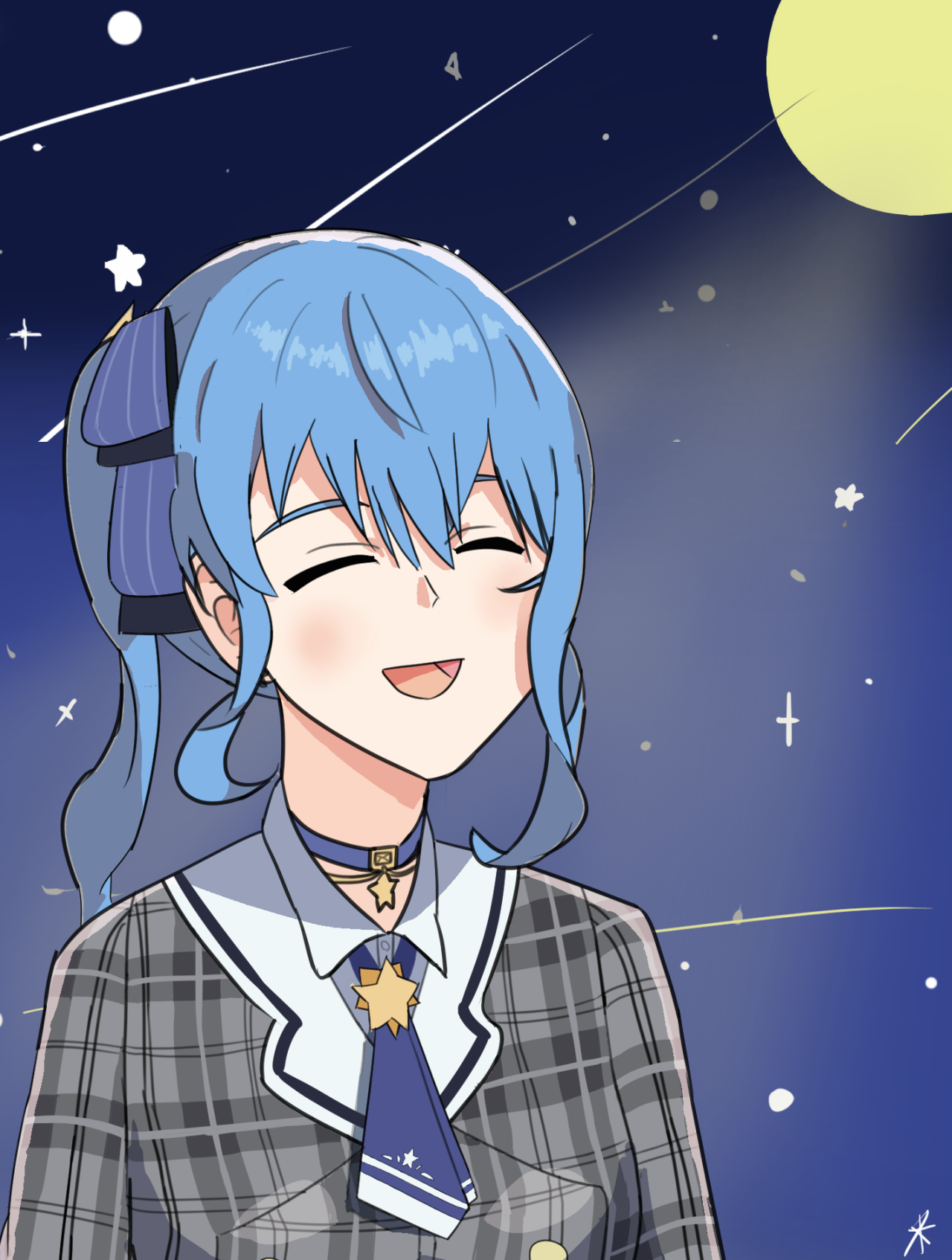
I hope this background can show that she is lighten up by a moon, and doesn't mismatch with the shades, shadows, and lights I added.
Wrap up
Here is the links to today's illustration on my SNS accounts.
Also, for future improvements, I felt it's probably better to try drawing anime characters by deforming from real people, so that we can understand how to draw lines, colors, shades, shadows, and lights. I didn't do it, but will try it and see how useful it is some day.