Practice drawing a head and face from a profile view
This is the note for my practice to an illustration by a beginner.
Today's illustration
The above illustration is the one before I practiced and below one is after I practiced. I haven't finished coloring most of shades and shadows because I would update the original illustration after this practice.
Before

After

In this time, I changed face and head to make them look a character more female, because originally it doesn't look. These are summaries for my learnings:
- In many articles or many people said, womens should be drawn more rounded and not sharp or square shapes.
- Consider affected areas while drawing lines especially it's not from front view. In this case, I should have cared how the cheek and jaw look when I drew a mouth and eyes
- Eyes are not wide enough to touch with a side hair from a profile view. I should have drawn smaller.
Here is the links to today's illustration on my SNS accounts.
I tried these steps to improve this original illustration:
- Self review my illustration
- Pick up a few things for improvements
- Practice and figure out a few things I can improve
- Redraw my illustration and check what was improved
Review my illustration
What can be better
- The head or face can be softer and look her more like a woman
- Breast can look more 3D and also can recognize its shape
- Skirt should be affected by gravity, so should belt chains
- Directions of hands or nails can be more natural towards the far side
- Hairs can have more details
- Hair pin can look more natural from this angle
- It's obvious that boots are duplicated, so make them less obvious
What was drawn well
- The pleat on the skirt looks good, and also its wrinkle does, too
- One of boots is drawn well
- Shape of legs is not so weird
What I practiced
On this time, I chose to practice improving the head and face of the illustration. From this head, I felt a creepy impression from this illustration, especially because she is not a female. At first, I need to figure out why it does.
I just hide color layers and frame line layer, but it didn't change the impression so much, so it turned out it's from line layers.
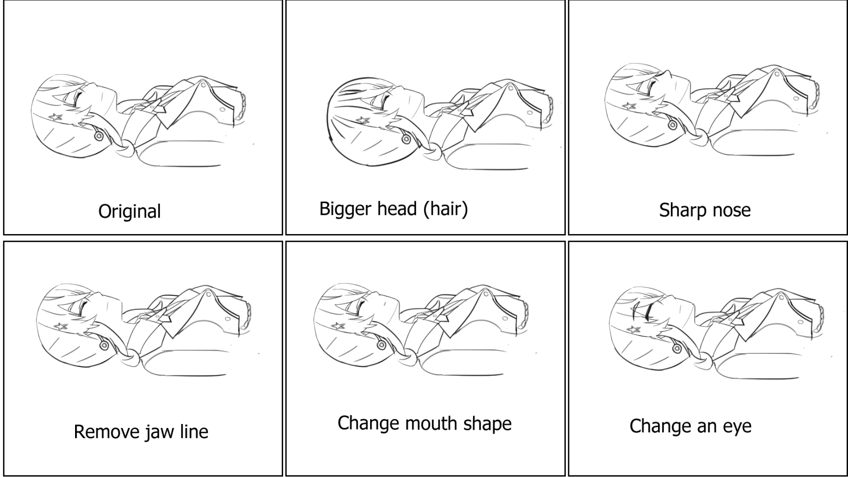
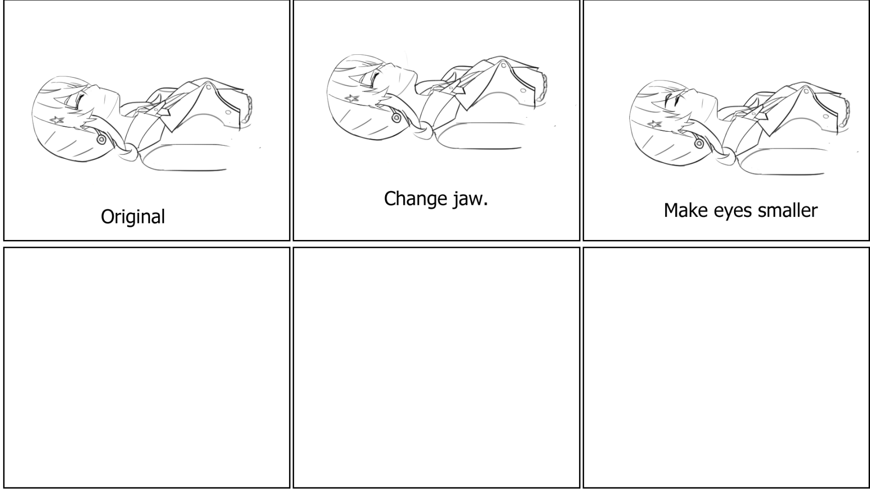
So, I copied original illustration and changed a little bit on each head or body part, and see how's gonna be changed. Following illustrations are things I changed and saw how it changes.
Practice 1

Practice 2

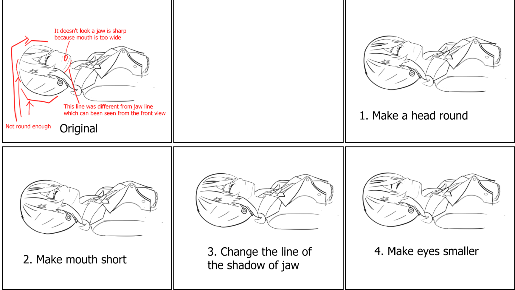
Practice 3 (Improve an original illustration one by one)

What I found
I still feels it's not completely natural for a woman's character, but it's hard for me to figure out why it isn't. I need to have an ability to recognize what gives how I feel, but things I found this time are:
- In many articles or many people said, womens should be drawn more rounded and not sharp or square shapes.
- Consider affected areas while drawing lines especially it's not from front view. In this case, I should have cared how the cheek and jaw look when I drew a mouth and eyes
- Eyes are not wide enough to touch with a side hair from a profile view. I should have drawn smaller.
What I redrew and what was improved
So, I redrew the illustration with these changes. And this is the one I redrew after the practice.

And I completely remove the line of the side of the jaw and instead color the shade of the neck, because the line still gave me an impression as a male character. Instead of showing the line, I change the layer of it to the draft layer, so that it won't show up after I export it to an image, if I'm not mistaken. But this change may not be necessary, because when you can see anime, the line for a jaw is clearly drawn for a profile.