Practice illustrations
This is a note when I, a very beginnner of an illustration, practiced drawing an illustration. I left them here so I can refer to this in the future.
Today's illustration
These illustrations are those I drew very seriously, but left one is before practice and right one is after practice.
| Before | After |
|---|---|
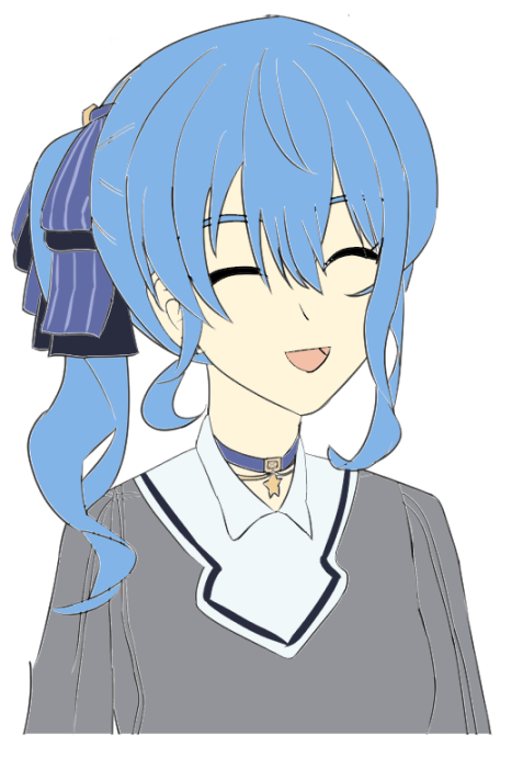 | 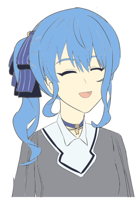 |
Here is the links to today's illustration on my SNS accounts.
I tried these steps to improve this original illustration.
- Figure out what can be better
- Pick up a few things I need to focus on improving
- Practice and figure out a few things I have to do
- Redraw the illustration and check what was improve
These steps are from some steps as Naoki-sensei introduced in his video to get drawing better as early as possible in 3 months (no English).
1. What can be better
I listed up what I felt these can be improved.
Face and hair
- Smiling face should be more natural, less weird, maybe around eyes or mouth is a cause.
- The line of eyes makes a weird impression and looks like fox.
- The line of the face isn't very natural, perhaps the face may be bigger or the jaw can be rounder.
- The amount of her hair may be more
- The angle of her side tail hair can be improved and can be more natural.
Body
- Her breast from the side view isn't well drawn.
- The angle of the necklace (choker?) looks weird and not right.
- The shirt collar looks weird shape.
- It can be drawn better between her arms and body.
2. What I practiced
Even though there are many things I was able to, I focused on these 2 things
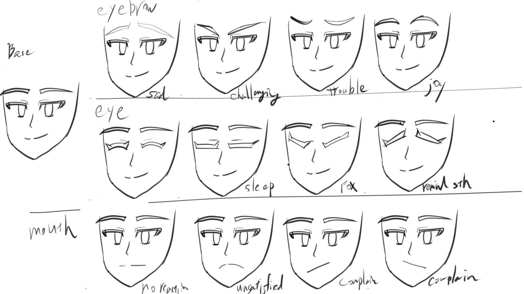
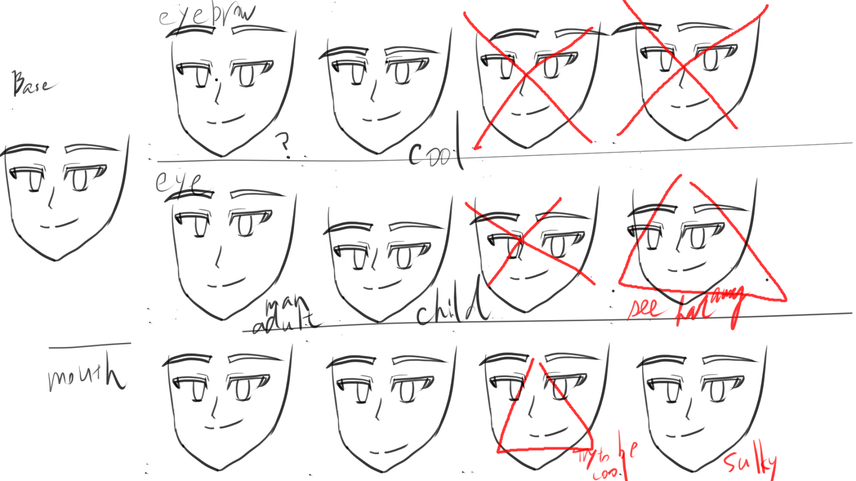
- Facial expressions, including a smiling face
- Heads, especially faces,, from multiple angles
- I also noticed I didn't draw ATARI and it was helpful to draw a head from a diagonal angle. ATARI is simple circles, rectangles, or lines to show the rough position or the size. I don't know how to say correctly in English, so I'll say it a wire in this page.
During practice, I read or checked these as learning materials:
- Book: Introduction to master faces, hair styles, and expressions in Manga from any angle (360°どんな角度もカンペキマスター!マンガキャラ顔・髪型・表情入門)
- Checked the pages to draw the head from each angle
- YouTube: Naoki Saito Illust Channel: Lecture to draw each expression easily (【簡単】表情の描き分け講座)
- No English subtitle
- You can see how eyebrows, eyes, or a mouth affect each expression
And following illustrations are examples of what I drew.
- Facial expressions
- Change an angle of each face part
- Change a position of each face part
- Change an angle of each face part
- Heads from multiple angles
- Drew without a wire
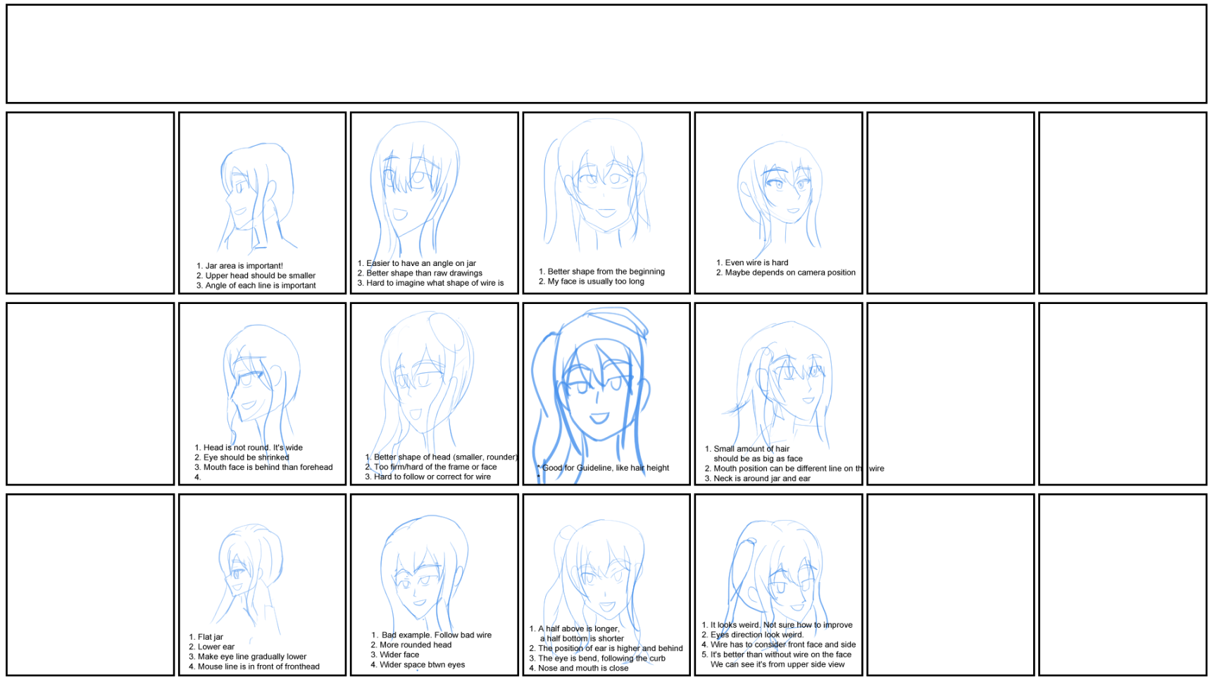
- Drew with a wire
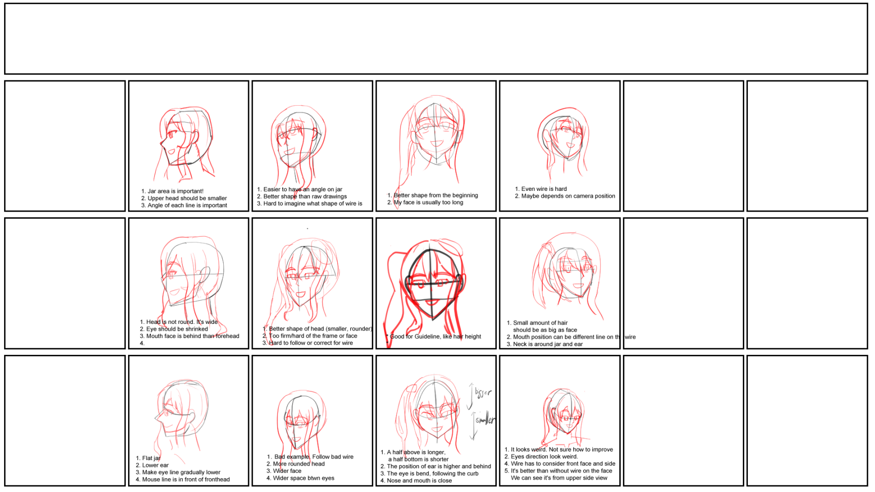
- Drew without a wire
3. What I found
Facial expressions
I changed each part of a face and checked how it affects, but because there are so many patterns and not very particular common things, I couldn't find a lot.
The things I found was followings, though I saw these in the above video:
- Distance between eyes and jaw: Shorter it is, more childish
And from the above video, eyebrows show what expression is mostly, and mouth shows how strong the expression is. Anyway, I felt that the weirdness of my original illustration was from the face of the angle and not from the smile face.
Heads from many angles
I found these things:
- Angles affect each distance and shape
- If the angle is from the above, the distance between a nose and a mouth is short. It's opposite if the angle is from the bottom.
- The eye is not on the straight line, but it's on the curved line.
- If the camera position is closer, then the head gets big and wide. It's opposite if the part of the head is far away.
- If the angle is from the bottom, then the bottom part of a jaw can also be seen and we have to be conscious
- For the side profile, the size of eyes gets smaller than other angles
- For the side profile, the size of head is not complete circle. It's bigger than circle
- Eyeline is important.
But overall, how to see a head and face is case by case on each angle, so it's better to see a model and check how it looks during drawing an illustration always.
Other learning
Draw frame lines with equal margins
It's a side topic, but it was helpful when I drew many illustrations and changed each a little bit from others. On Clip Studio Paint, it's easily be prepared by:
- Select
Frame borders > Recntagle frameand draw it - Right click the Frame layer and select
Ruler/Frame > Divide frame border equally - You can choose options for the number of vertical and horizontal divisions and also divide folders
What I redraw and what was improved
So, again, this is the same image on the top of this page.

What I changed was
- Eye angles: Before updating, eyes were drawn as if it's on the straight line, but after practice, eyes were like on the curved line.
- Eye and mouth positions: They were low compared to positions of ears and jaw, so I lifted them up.
I think it reduced the weirdness of smiles from the original illustration.
Wrap it up
This is the first time to write a post for an illustration and actually, I didn't think I was going to do while I was practicing, so maybe some illustrations or some explanations are not explained enough to be understood. Anyway, I felt it didn't improve a lot as I wanted, but at least changed the impression a little bit and reduce the weirdness. I guess face is one of the most important part in our body and made a big impact by changing it.
Anyway, I'll keep doing this and hope it's gonna change my drawing skills.